Single div CSS animations
I recently got inspired to try pure CSS single div animations, as I came across this blog post (thank you, Gabrielle!). There were only two problems:
- I can’t draw
- I don’t know enough about CSS
It seemed impossible to tackle without a lot of effort, so I’ve been putting it off, until I realized the more I think about it, the harder it gets. I decided this is more of a learning challenge than it is a problem. Would I ever be able to draw well enough to be a designer? I don’t think so. Would I be able to have fun creating a small project from time to time and see improvements? I betcha.
How do I usually approach learning a new programming concept?
- I read about it and find a tangible example
- I look around the example and break it in a controlled way, to make sure I understand what happens
- I come up with a small enough problem of my own that uses the concept I want to learn and keep the example as reference, googling for other ideas and suggestions
- I incorporate the concept into other projects, to make sure I understand it
For the animations, I decided there are a few key factors:
- I want to make them cute, so that I’ll share them and get encouraged to create more
- I want to write quality code, not just make them look good
- I’d like to be able to plan my approach before coding, either by drawing them by hand or breaking into building blocks
I can’t draw
The more I work on my laptop, the less I write, so my handwriting went from cute tiny letters to barely legible tiny squiggles. And even though I can draw a passable cat (meaning - my youngest sister can identify it as a cat without much trouble), I don’t think I can draw.
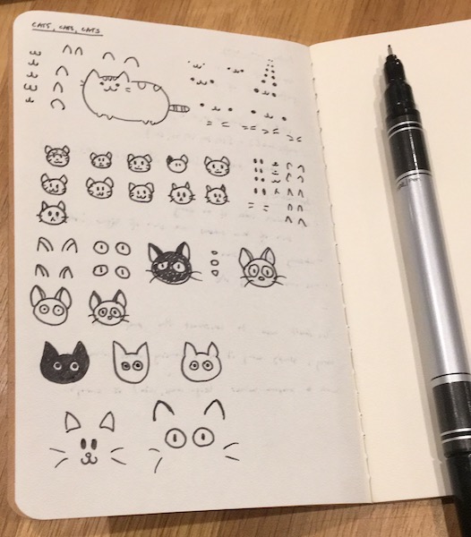
For the initial experiment, I decided to explore what makes for a cute cat. I looked for various tutorials and thought of a few key features:
- pointy ears, usually a bit rounded
- cute little nose, sometimes heart-shaped
- big eyes, with or without snake-like pupils
- tiny mouth, often smiling or meowing
- whiskers, usually 2 or 3 on each side
- oval or rounded head
I then explored them on paper, to get a better grasp of what I need.

Finally, I worked to recreate this cute cat animation and it sort of, kind of worked. Granted, it’s not my own design and I didn’t fully understand what was happening with some parts of it, but I’ve learned to decompose an image and then translate it into basic shapes, colors and layers. Also, it wasn’t yet a single div image - but I was getting closer.
I don’t know enough about CSS
Don’t get me wrong, I know enough CSS to create websites and work on HTML email templates (which require you to write CSS like it’s 2004), but I’ve never gone into more intricate styling techniques.
For one, I am not a designer and designers usually provide me with either images or relatively simple UIs to code. It doesn’t make much sense to use CSS images in a production environment - who has the time to write and review them?
But CSS seems like a good medium for me to draw - I can build on basic shapes as I deconstruct images and the examples are reproducible (which I can’t yet say about my hand-drawn images).
I looked for more examples and came across this talk by Wenting Zhang. I decided to follow along with the tutorial and create a simple mustache animation.
It was a great exercise, as it taught me a bit more about
box-shadow, most importantly, that there is no limit on the
number of shadows and they can be moved around, stretched and
recolored. It also helped me start treating :before and
:after pseudoelements as layers.
I then proceeded to create a few more animations, trying to
get a good grasp of how I should divide my images between
those layers. It turns out there is a lot of flexibility with
shadows, but reshaping is not their strongest feature - they
mostly stay the same shape as the initial layer and, although
they can be manipulated with border-radius, since I wanted
more than a few basic shapes in my drawings, I needed to learn
more.
Still, I could now create pretty complex shapes with three
layers and box-shadows, like this animation of the Recurse
Center logo.
Creating shapes with a single div is sometimes quite
challenging and can use all three layers (the div, its
:before and :after). One a tad more complex shape I wanted
to use was a chevron, in order to create a simple animation of
the Xfive logo, similar to the one on
their website, but created with pure CSS. For this I needed to
learn and understand gradients better, so I turned to the
CSS Secrets
book - after doing a few exercises, I felt ready to create
multiple gradient layers and mix them up with pseudoelements
and box-shadows.
What’s next?
I want to further improve both my drawing and CSS skills. I’m planning to do a bigger project soon, but for now I’ll try to do a few CSS animations a week - you can check out my GitHub repository for the animations’ code and my CodePen to view them (along with some bits and pieces from various old projects).